Twitter is always in a state of upheaval, fueled further by Elon Musk’s recent acquisition of the social giant. Successful strategies from twelve months ago no longer provide the same results and game developers are left guessing at what changes to make in order to reach their audience. Social measurement and analytics are a key part of Acorn Games’ social strategy and these changes have provided interesting clues as to the future of the platform.
Change is also in the air over at Instagram, with a shift towards short form video… and then back again towards static imagery, as cited by the company’s boss in recent months. Navigating the footsteps this delicate dance requires has been a worthy challenge for any social media agency over the last year.
We look back at the whole picture, across both platforms, breaking down stat by stat to ascertain your best strategy.
The data below is delivered anonymously both from our clients and from the wider industry, primarily focused on the European audience. Be aware you may need to apply what we’ve discovered to your own niche and location.
To GIF or not to GIF?
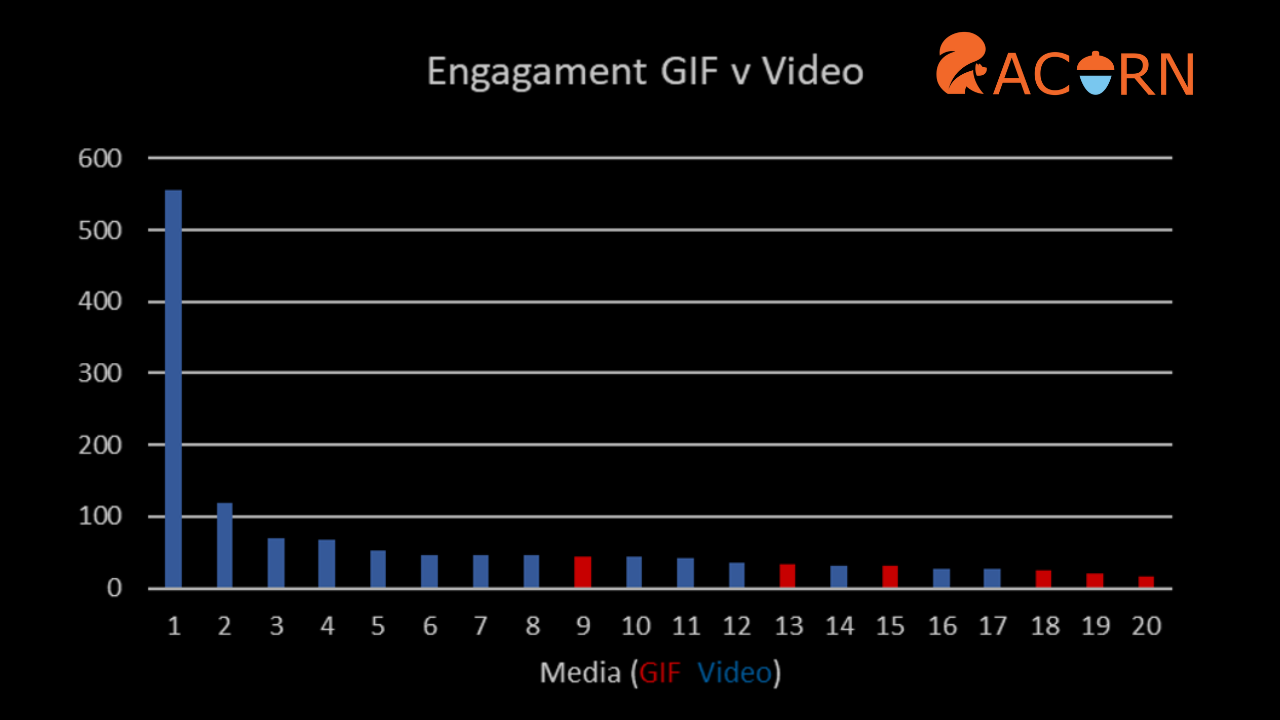
On Twitter we took a solid month of data and analysed posts containing GIFs versus those with videos. They’re both visual, and in some cases show the exact same thing, but our findings were that the videos far outperform any GIF posts we have in terms of engagement and reach. As a result, we’ve almost eradicated GIFs from our strategy, except in the case of replies, where GIFs serve a unique function. Videos look cleaner, load faster and offer a lot more information. Even short videos can include .SRT files for subtitles, invaluable for an audience that consumes most content on mute.
Best Time to Tweet
After diving deep into a whole years’ worth of numbers, we saw that much of our audience interact with our tweets as early as 7am and continue to do so right up until midday. We’ve started to post out tweets earlier, looking to gain more eyeballs.
The Instagram audience is more active later in the day, interacting with increased frequency from around 5.30pm. This sets our future strategy a good hour earlier than on what we’d previously targeted.
Square, Wide or Tall?
The size of an image makes a big difference on both Twitter and Instagram. We took data from our best performing image posts across 12 months, and sat them side by side. Twitter and Instagram work completely differently. A square image is much preferred by Instagram yet Twitter loves a wide asset. If a square image is posted on Twitter it doesn’t get as many interactions at all, and the same on Instagram for wide images. We still do change up image sizes all the time to test, and recently wide images have been performing OK on Instagram, but we still predominantly use tall or square.
Images for Likes, Text for Replies
Twitter prefers the inclusion of an image, almost always providing wider reach and engagement in terms of likes. We additionally tested polls and posts with no image and analysed the outcome. Over a six month period we took text only posts and studied their generated impressions. The big number for us was in the replies, where our text only posts have a huge 78% more replies than those with an image. Taking this information, we now add a lot more text-only posts to generate discussion, often asking a question.
The blue tick question is one which we’re looking at now. How will it affect not just the metrics, but the way an account is perceived by its audience.
The way we interact with social media and the data we gather dictates how we go about planning our strategy. With social policy changing month on month, our fortunate position working with both global brands and innovative indie games gives us a unique perspective on the industry and how to generate engagement across Twitter and Instagram.


