Everything begins with an idea. 🌱
We live and breathe gaming, so when we formed Acorn back in 2018, it might be a surprise to some of you that we wanted to come up with a name without roots in the industry.
The thought process here was that doing so would give us plenty of room to experiment and potentially even branch off into other areas in marketing, or beyond. Acorn Games Advertising, Acorn Influencer Management, Acorn Bathroom and Tile—you get the idea!
We also wanted to buck the trend of agencies picking a goofy gaming name that leaned into a trope of a particular genre or gaming stereotype. It’s important to show how the games industry is a growing, diverse place for new types of games and players alike to emerge. Leaning into a 15-year-old Counter-Strike reference doesn’t achieve that.
But, why Acorn? As a word, it’s rather unassuming.
The humble acorn embodies the core ideal of our company: Something small and unassuming can grow into a powerful titan. Just as an acorn grows into an oak, we’ve helped nurture many indie games from hidden gems into widespread gaming hits. This is something about which we're particularly proud!
We decided that Acorn was simple, easy to spell, and great for SEO. It also ties in nicely with our UK roots, a country with millions of oak trees—and nearly as many squirrels.
The idea was in motion! An agency focused around the little guy, backed by a forest of connections from the big players in our industry. With the name finalised, we began working on our branding. We started by getting everything down on paper. And I mean everything.
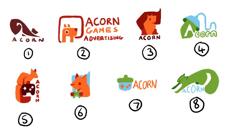
The original designs were all about fun and experimentation.
Our ideas were a little obscure; playing with typography, tree imagery and even a cartoon squirrel. The idea of an energetic and bushy-tailed buddy playing games was fun, but we decided to keep things simple, in case we wanted to take the company in a different direction in the far future.
Early on, we realised that fun visual designs work better for t-shirts and social media. During those stages, we also toyed with the idea of a typographic logo. The letters AGA (Acorn Games Advertising) allowed for some interesting design concepts, but since most of our work was—and still is—global, it didn’t really feel like the right choice to lean into the lettering. We moved towards the idea of a ‘mascot’ for the company, and that’s how the squirrel came to life!
As the original ideation process came to a close, we were left with dozens of unique designs; some focused around the squirrel, others centred around the acorn. Our second choice, used in letterheads and displayed as our website favicon, is the stylised acorn itself.
It was then time to breathe new life into our designs by working some digital magic.
When it came to colour choices, we settled upon the acorn orange (#f26829), secondary blue (#79c7ef), and tertiary green (#72a33b).
These colors looked great together and helped our brand stand out amongst a wash of muted blues and blacks in the industry. At the same time, they also presented more of a playful and creative look. It was only later that our original tertiary green was replaced with a slightly more mature grey (#7f7f7f), far more appropriate for documents like slide decks, legal agreements and invoices!
After working with our designer on several different concepts, we finally had something truly unique. The original playfulness and energy were still there, but our ideas were more forward-facing and mature. We were keen to include a subtle ‘A’ shape in the design, which we established with the body and legs.
These designs were playful yet dynamic and straightforward.
Everything was going great, and we had a design with which we were happy, ready to peer test it with our clients. This was our first major hurdle! We were surprised by their feedback and shocked to discover that many saw a fox instead of a squirrel.
There was something about the way our mascot stood that didn’t seem so squirrel-like. We went back to the drawing board.
Unfoxing our squirrel with new concepts.
We worked with @Melophilus on new refined concepts and came back with a second visual, actually much stronger than our original design.
These final concepts looked great, encompassing Acorn’s identity.
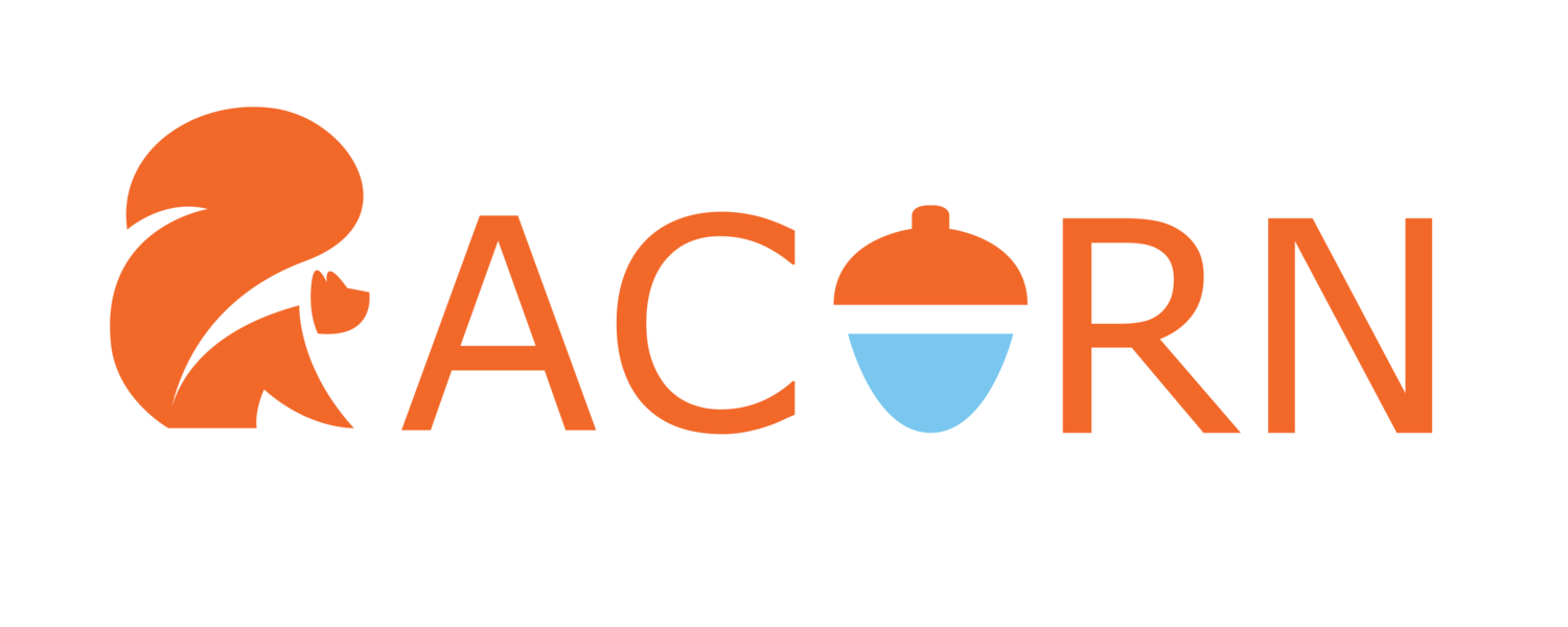
We refined the positioning of certain elements and finally, after a long and tiring journey, we settled on a logo that ticked all the boxes—and was most definitely a squirrel.
It took longer than originally anticipated, but the result speaks for itself. Why did we insist on getting the logo right?
Well, a good logo grabs the customer’s attention and leaves a strong impression. But a great logo can do so much more. Tied to the company’s identity, we want our logo and branding to last for years, especially when it pops up again and again in games’ credits as a mark of quality to both gamers and game developers. Although visually simple, our logo is fun and playful while staying true to our vision of constant growth and improvement.
Our logo story may have come to an end, but our advertising adventures continue.
If you’re thinking of creating your own logo, start by looking inward. Stay true to your values, and let your imagination guide you. And most importantly, when testing things out, don’t be afraid to ask your clients!


